
Vending Central Controller
Kiosoft
Sept-Dec. 2026
Visualizing machine health to drive sales teams
Design: Emily Chan
Design Lead: Alex Rose Henry
Dev Lead: Niko Fu
The Problem
A large learning curve for stakeholders
Created by convoluted flows, buried buttons, and unclear copy
Operational costs directly impact revenue

Users of the Central Controller:
Operators
Restock machines + diagnose errors
Configure products + customer-facing content
Sales Team
pitch vending hardware + software package
Onboarding + tutorials for new clients
When I joined, feature specifications were mostly complete.
My responsibility was translating them into interfaces, and bringing up any gaps.
A design system for large tablets
I started with creating a design system in Kiosoft's design language for their upgraded 19'' tablets
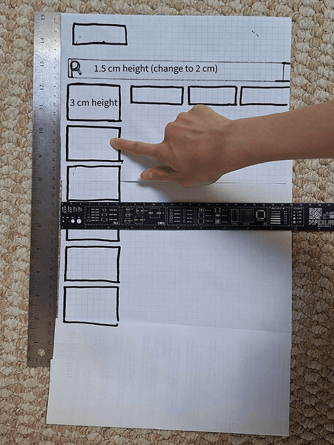
Getting used to the scale and sketching out touchpoints based on ADA

Reviewing international kiosk competitors (touchscreen vending is more common in Asia!)

Discussing device lag and navigation considerations
A foundation for Kiosoft's design of large tablet interfaces

Next, use the components to consolidate user flows
The amount of tabs + buttons is overwhelming.
Currently subpages edit individual information, yet they overlap.
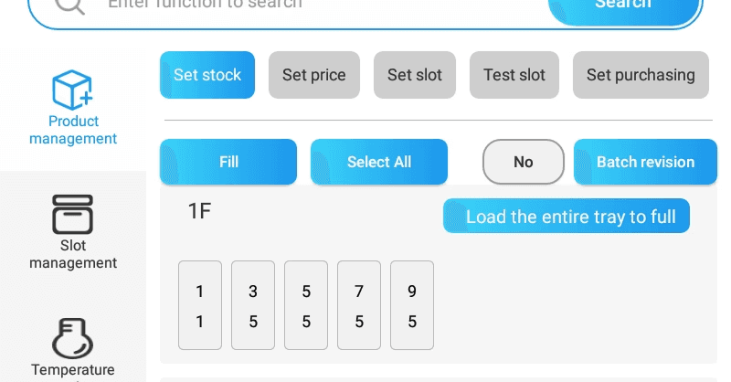
stock

Price
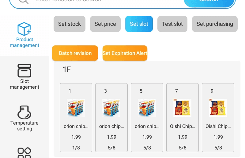
Image, stock, price
Organizing tasks by frequency and urgency

What I found:
Action Type
Frequency
Daily
Needs
Separate, fast workflow

I cut down on subpages by consolidating monthly updates in one page, and daily updates in another.
Next, the buttons.
Revealing the hidden rules to refill stock

A consistent mental model is needed.
Creating clear progression and copy
Remove hidden interactions
Consolidating "load tray" and "fill"
⤷ Introducing the term "autofill", which applies to any selection
Consolidating "batch revise" and *long press*
⤷ Introducing "revise" to always open the same modal
Input from operators

Original
2 Steps
I found it strange "batch revision" was required to enter "edit" mode

My Ideal
1 Step
Since stock refills happened so often, I thought it'd be better to remove the preliminary step and change the copy to "edit'

Final
2 Step based on competitors
Operators service multiple vending machines from different companies daily. They preferred the 2 step out of muscle memory, with "revise" being the common language in competitor software. "Edit" replaced "batch revise" as the entry to edit mode.
The impact of the new mental model
A reusable slot/tray selection flow that was able to be reused for:
Phase 1: Stock refill, image/price updates, slot capacity edits, slot testing
Future phases: slot splitting/merging, machine calibration
Final Designs
Visualizing machine health with Central Controller
Workflows made for day-to-day, and month-to-month tasks
Diagnose connection problems for new vending technology
Maintain company partnerships with ads
Reflection
Hybrid design is a bridge
Sometimes we think something is intuitive but for legacy systems the old fashioned way becomes the industry standard so design with that in mind and always clarify.
Working with devs feedback helped me break free from personal bias. Staying flexible made my work realistically helpful.